

Jukin Media
TBD REBRAND
-
Transform a short-format TV channel for timewasters into something bigger—while staying true to its beloved roots.
-
Keep it light & fun, but add substance—transforming image from “stoner humor” to trendsetting, smart, informative, cool.
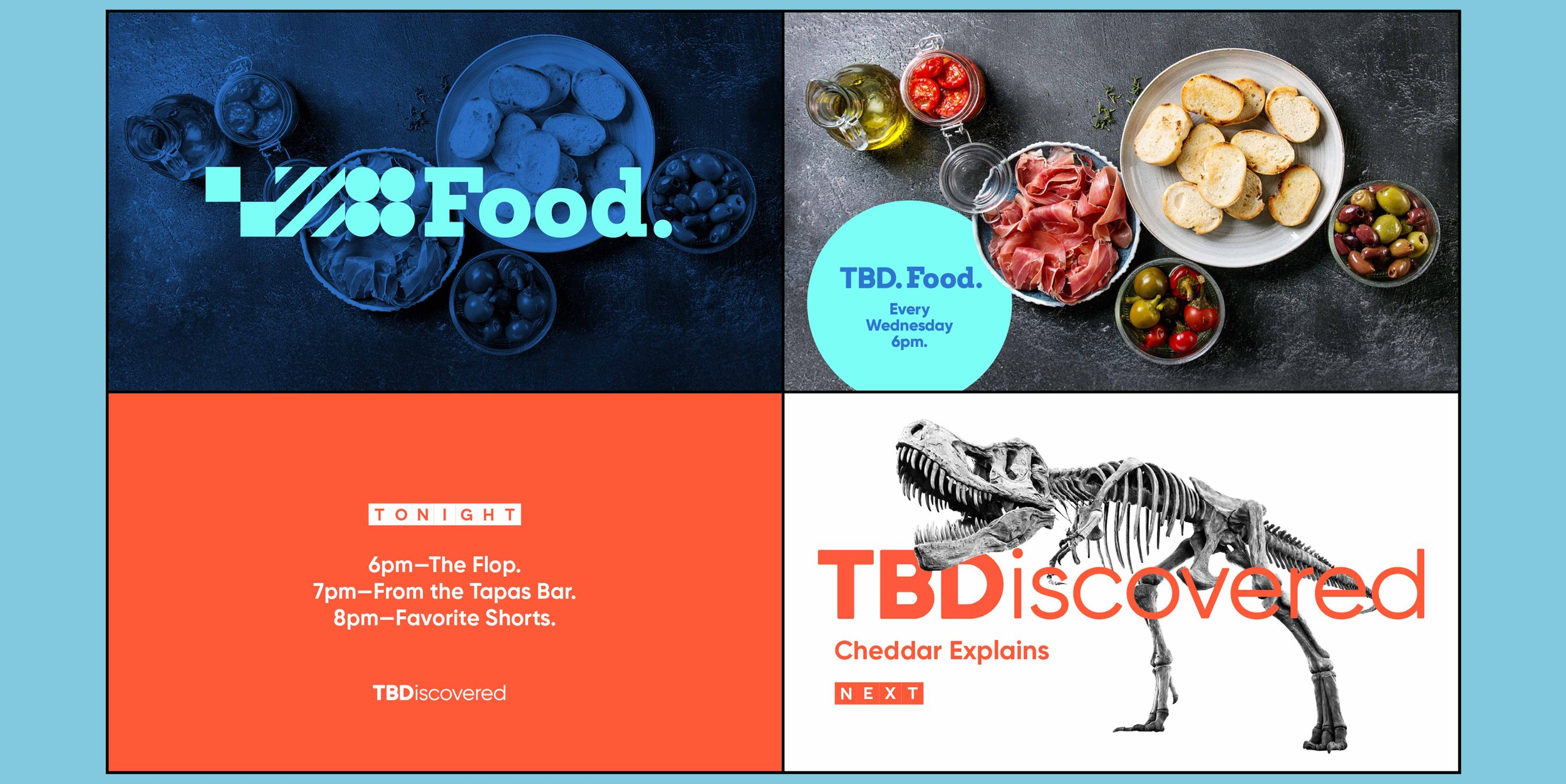
Continue celebrating randomness of programming—but reposition it as rich variety (a TV “tapas bar”).
Ensure elasticity—so brand can accommodate new & unexpected content opportunities.
-
We evolved the brand elements—bringing each to a new place while keeping a connection to its origins:
Name’s meaning: To Be Determined is now To Be Discovered (so viewer is driving experience, not network).
Logo: from slot machine with funny icons to cells with geometric patterns (creating cleaner, more abstract, more decorative feel).
Colors: from hard “crayon box” shades to softer, quirkier palette (to create more artisanal, curated feel).
-
New brand concept & evolved story
New visual identity system
New Brandbook