
Visit West Hollywood
WEHO DESIGN DISTRICT BRAND
-
Revitalize a bloodless, stale Business Improvement District—adding new vibrancy, glamour, & cohesion.
-
Create an identity that’s:
High-end—but not uptight
Luxurious—but not gaudy
Vibrant —but not garish
Confident—but not crass
Distinctive—but not trying too hard
-
A fresh new identity that combines chic with bold:
Brand positioning & messaging
Logo
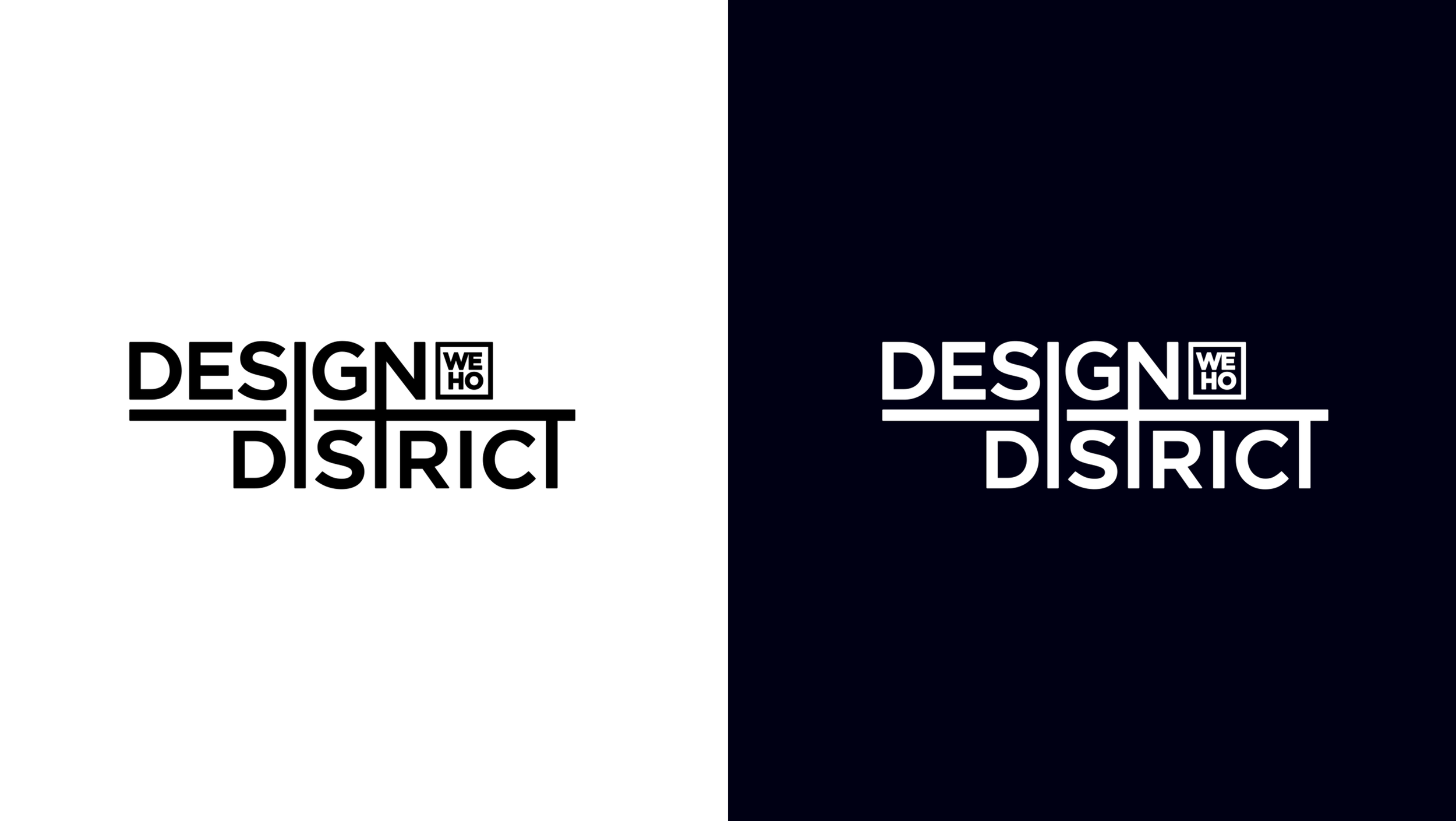
Custom, sans-serif type is warm & strong—yet clean.
Extended stems & crosses of letters:
Suggest urban
Create infinite variety of elegant decorative patterns.
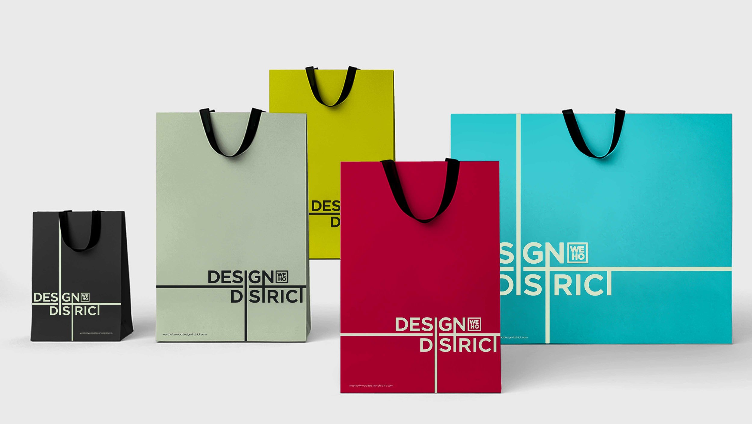
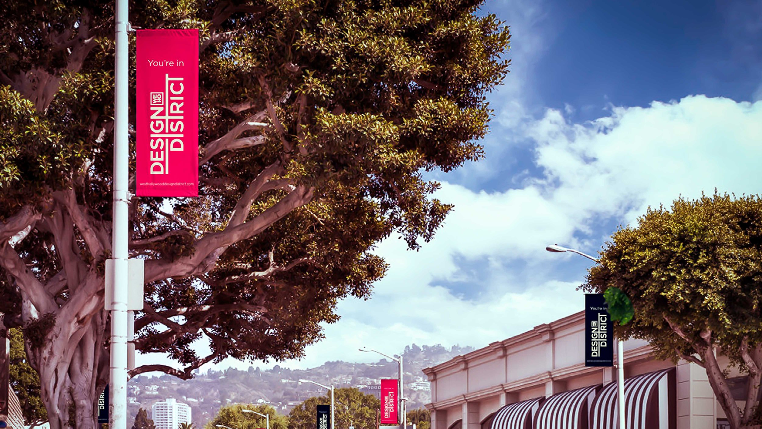
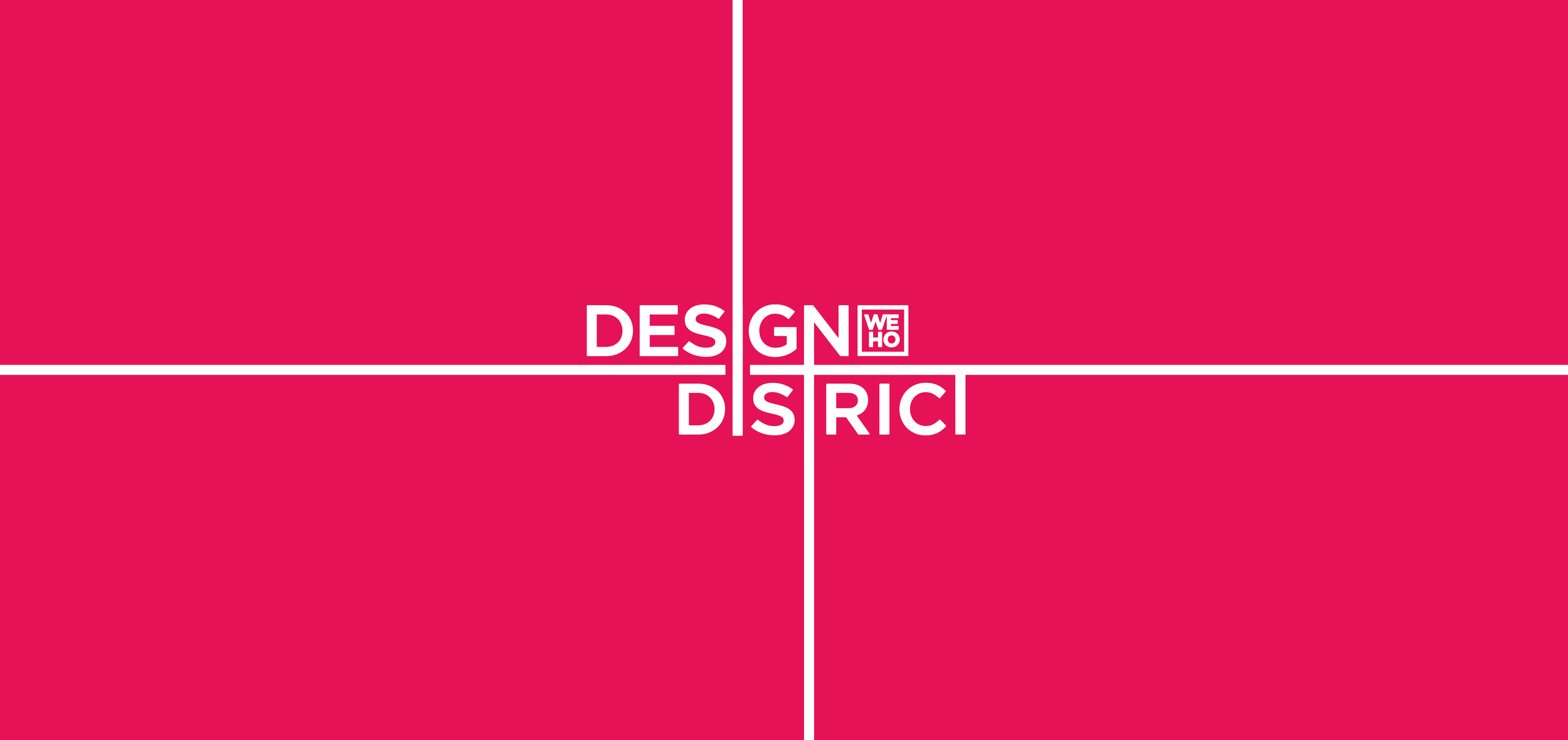
Colors
Foundational palette (pearl black & cream) is neutral & sophisticated.
Accent palette is intense—but handled with care.
Messaging & Voice
Stakeholders were trained to talk about the District as a lifestyle destination that emphasizes high-end design.
Mission was created to give equal emphasis to commerce, community, & trendsetting.
Tonality was shifted from “generically cheery” to calm, cool, authentic, assured.
-
Brand positioning & messaging
Visual identity system
Brandbook